A note to self on how to make HTML text with gradient background.
Introduction
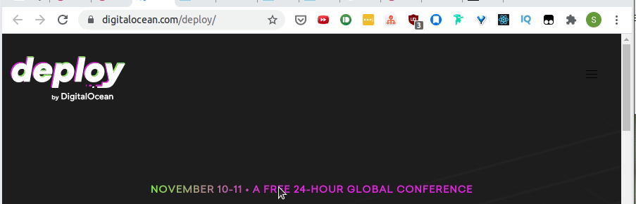
I saw a cool text with animated gradient for text on Digital Ocean's Delploy conference site.
I wanted to know how it was implemented but didn't know how the gradient font was implemented in the first place.
An easy trick on CSS Tricks?
CSS-Tricks has a short article, Gradient Text, on how a gradient font is implemented.
1h1 {2 font-size: 72px;3 background: -webkit-linear-gradient(#eee, #333);4 -webkit-background-clip: text;5 -webkit-text-fill-color: transparent;6}
Source from CSS-Tricks article, Gradient Text.
As the CSS vendor prefix, -webkit shows, it works for browsers like Chrome, Safari, or new Opera browsers (Works on FireFox on testing).
Webkit properties
- -webkit-linear-gradient: An easy way to implement a linear gradient (introduced in 2008).
- -webkit-background-clip: Works on text clip while background-clip doesn't.
- Even MDN uses -webkit-background-clip for the text clip demo.
1.content {2 background-clip: text;3 -webkit-background-clip: text;4 color: transparent;5} - ⚠ Provide a fallback color property incase the text clip doesn't work.
- Even MDN uses -webkit-background-clip for the text clip demo.
- -webkit-text-fill-color: This looks replaceable with color property.
Animating the background
I have never used CSS animation and it requires declaring an animation as keyframes (a sequence?) and apply the animation on an HTML element using animation specifying
e.g.) Demo on CodePen
HTML content
<span class="css-gnissy">NOVEMBER 10-11 • A FREE 24-HOUR GLOBAL CONFERENCE</span>
CSS style
1.css-gnissy {2  background: -webkit-linear-gradient(right, red 20%, green 40%, blue 60%, cyan 80%);3
4  -webkit-background-clip: text;5  /*   6    `color` seems to work too7    -webkit-text-fill-color: transparent; 8  */9  color: transparent;10  background-size: 200% auto;11  animation: shine 2s linear infinite;12}13
14@keyframes shine {15  to {16    background-position: 200% center;17  }18}
animation: shine 2s linear infinite; breaks down to
- Keyframes name or animation-name: shine
- animation-duration: 2s
- animation-timing-function: linear
- animation-iteration-count: infinite
@keyframes seems like a monster of its own so I will just add an MDN link to refer to later.
Tailwind Gradient Text
You can achive the gradient text effect with Tailwind CSS with bg-clip-text utility.
1<div class="text-center text-5xl font-extrabold leading-none tracking-tight">2 <span class="bg-clip-text text-transparent bg-gradient-to-r from-teal-400 to-blue-500">3 Hello world4 </span>5</div>
Image by Lichtmagnet from Pixabay